

A Brand Built For Beautiful Data
Replica's "Product First" branding approach establishes a systematic and cohesive identity through its type, logos, colors, and illustrations. The responsive logo design adapts to different contexts, simplifying the mark as space decreases—first losing its outline, then reducing to the iconic "R" logo. This ensures brand recognition across various platforms.


A Modern Classic
Proxima Nova, was chosen for its functionality and versatility. It meets the demanding formatting requirements of data visualization while providing sufficient variation for branding purposes. This consistency in typography ensures a seamless user experience and brand presentation.

Colors that Scale
The color palette is developed using data science principles, specifically equidistant color scaling, to enhance geospatial data visualization. By selecting endpoint colors and creating a cohesive set through equidistant steps, we achieve a harmonious and aesthetically pleasing color scheme. This method ensures that all colors work together seamlessly, reflecting the brand’s commitment to clarity and precision in data representation.


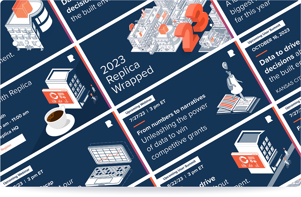
A Modular Illustrated World
To highlight the interconnectivity of the built environment, I created “Replica City,” a component-based illustration system made up of 15 tiles. Each tile represents a different aspect of Replica’s mission, from freight to urban life. The system proved highly modular, allowing tiles or fragments to be reused like LEGO bricks for new contexts and projects, while maintaining a cohesive visual identity.


More Work Examples

Tractics UI/UX Transformation

Replica Trends

Replica Places Studies

Studio.Replica Redesign

mySidewalk Dashboards

Replica Data Library